01
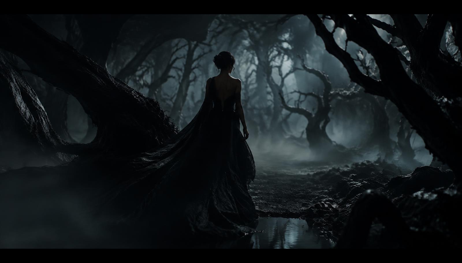
The Entrance
- Camera
- Wide, slow dolly forward. Low fog at knee height.
- Light
- Cool moonlit backlight; figure in silhouette.
- Sound
- Silence, wind through branches, the hush of silk.
- Intent
- Establish a world — elegant, enchanted, slightly dangerous.
01 — The Reveal
Cider Company
Bad Never Tasted So Good
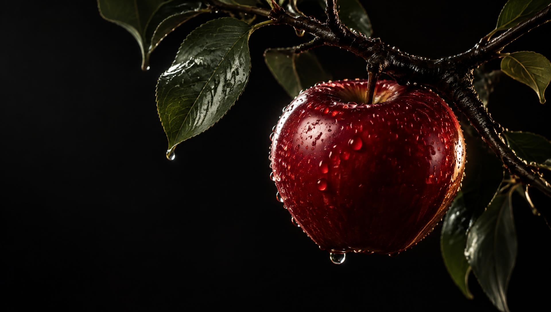
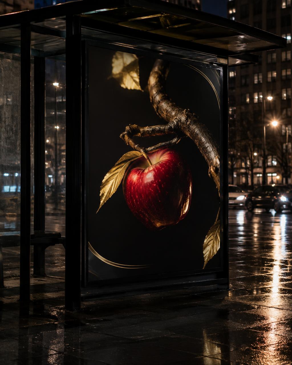
Not a rotten apple. The perfect one — so flawless you can't help reaching for it.
The name promises something undesirable. The image delivers the opposite. That tension — between “bad” and irresistible — is the entire brand.
Once upon a time,
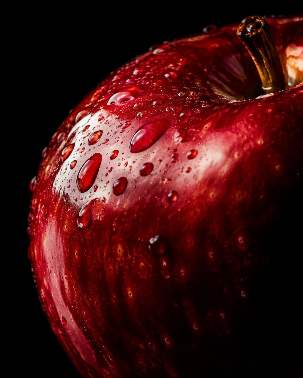
an apple was only an apple. Sweet, ordinary, forgettable. Then someone was told not to touch it.
From that moment it became something else entirely — a question, a dare, a small and beautiful risk. The fruit didn't change. The desire did.
Bad Apples lives in that moment just before the bite: the pause, the glance over the shoulder, the decision you already know you'll make.
It is a brand for anyone who has ever enjoyed something a little more because they weren't supposed to.
Creative inspiration
The emotional contrast of the fairy-tale queen — polished, luxurious and composed on the surface, with danger held in the palm of her hand. Translated here into an original world: no characters, only the feeling.
Primary Logo
Simplified
Monogram
Reversed on Red
Typography
A high-contrast serif carries authority. Spaced capitals give it air. A restrained script whispers the invitation. The tension between serif and script is the signature.
Display — Bodoni Moda
BAD APPLES
Secondary — Jost, tracked +600
Cider Company
Script — Pinyon Script
Bad Never Tasted So Good
Colour Palette
Midnight Black
#141011
Mystery, drama, sophistication. The darkness that makes everything else glow.
Forbidden Red
#A3181F
Temptation, beauty, desire. Reserved for the apple and the moment of choice.
Antique Gold
#C9A96A
Luxury, craftsmanship, refinement. Used like jewellery — sparingly.
Botanical Green
#2F4A3A
Nature, freshness, depth. A quiet reminder that the fruit is real.
Warm Ivory
#F3ECDF
Supporting tone for editorial pages, menus and readability.
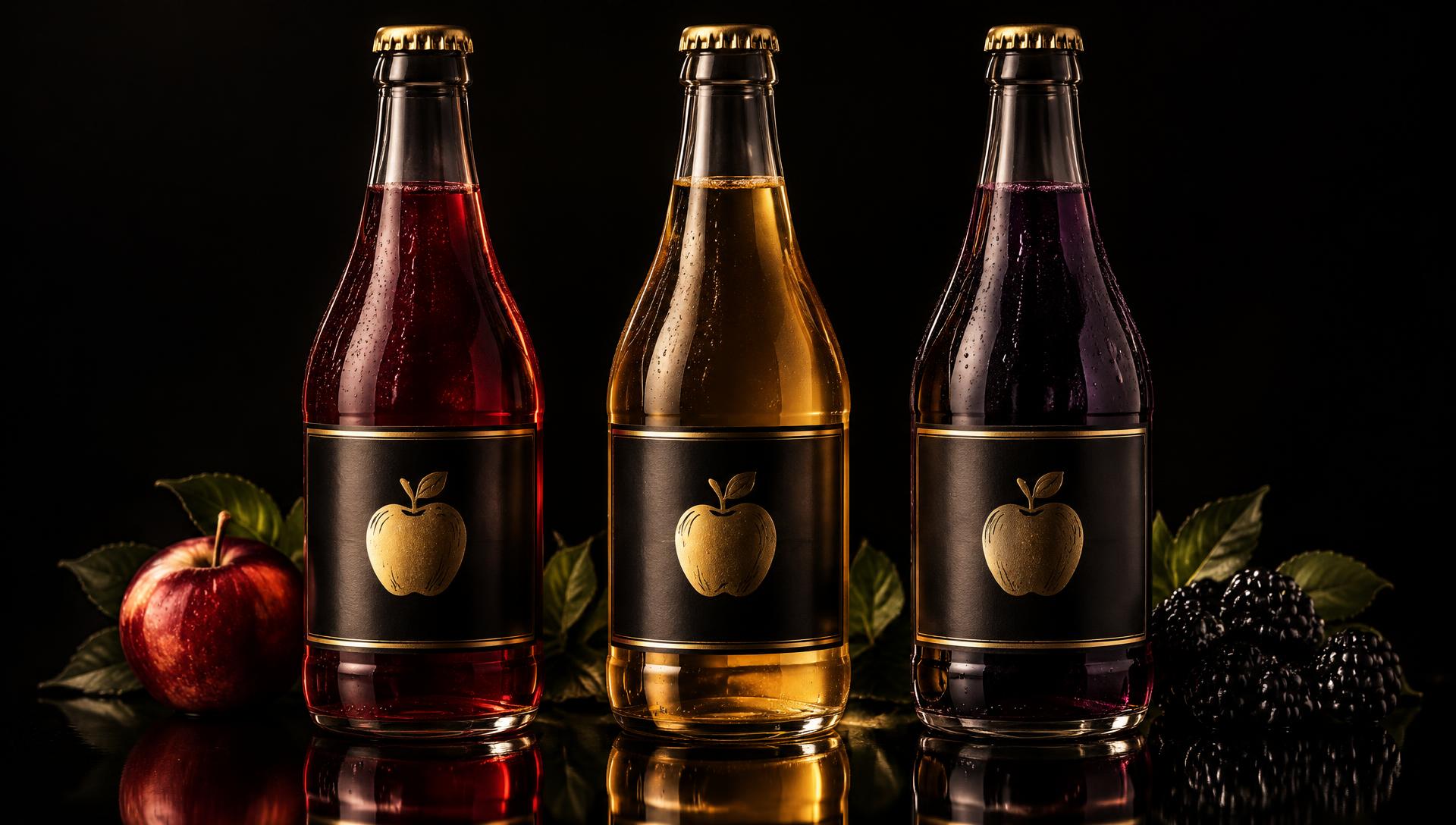
No. 01
The Original Sin
Rich ruby red. The flagship — the apple at its most seductive.
No. 02
Golden Hour
Sophisticated pale gold. Lighter, brighter, still dangerous.
No. 03
Midnight Berry
A darker, mysterious berry-inspired variation for after dark.
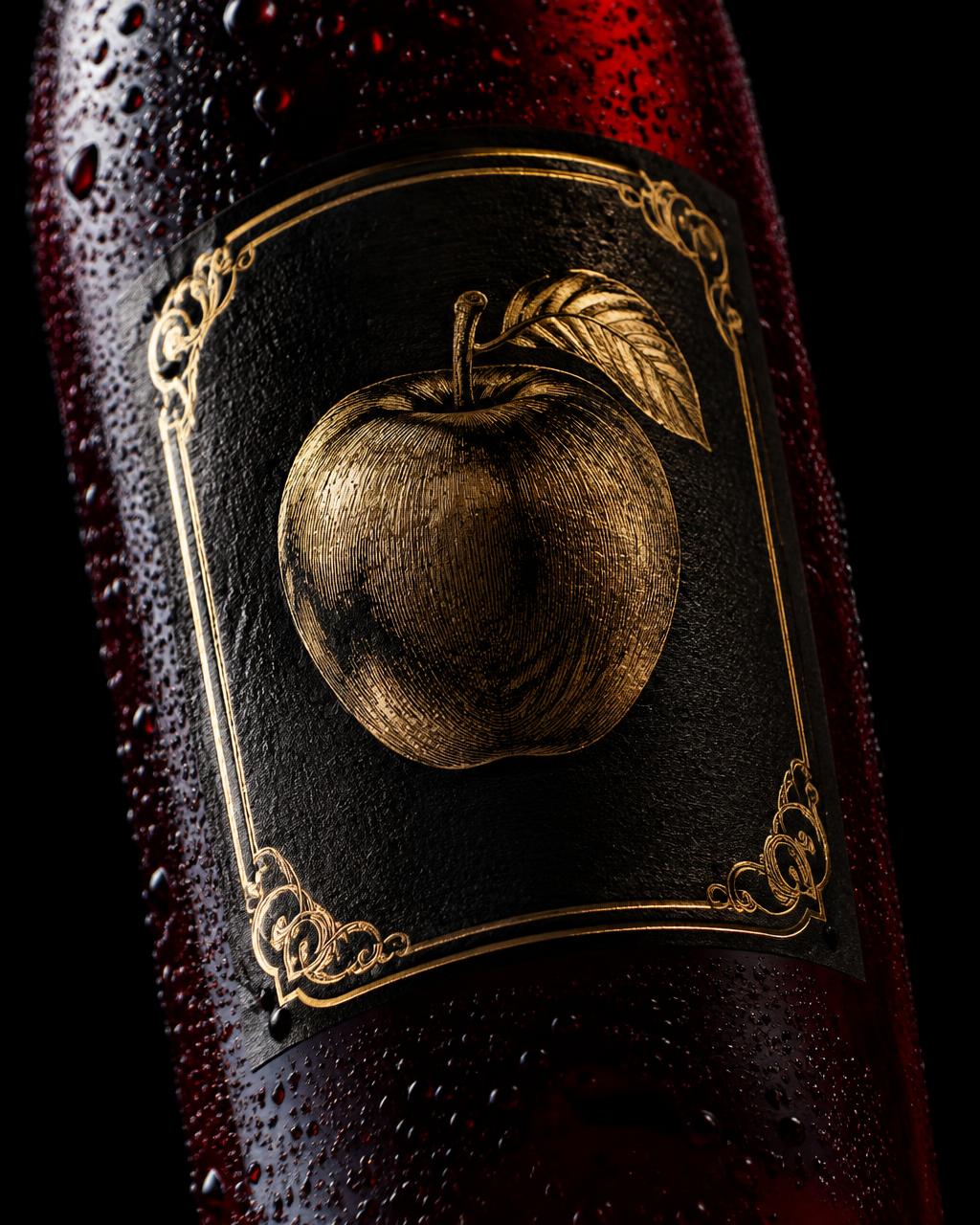
Label Detail
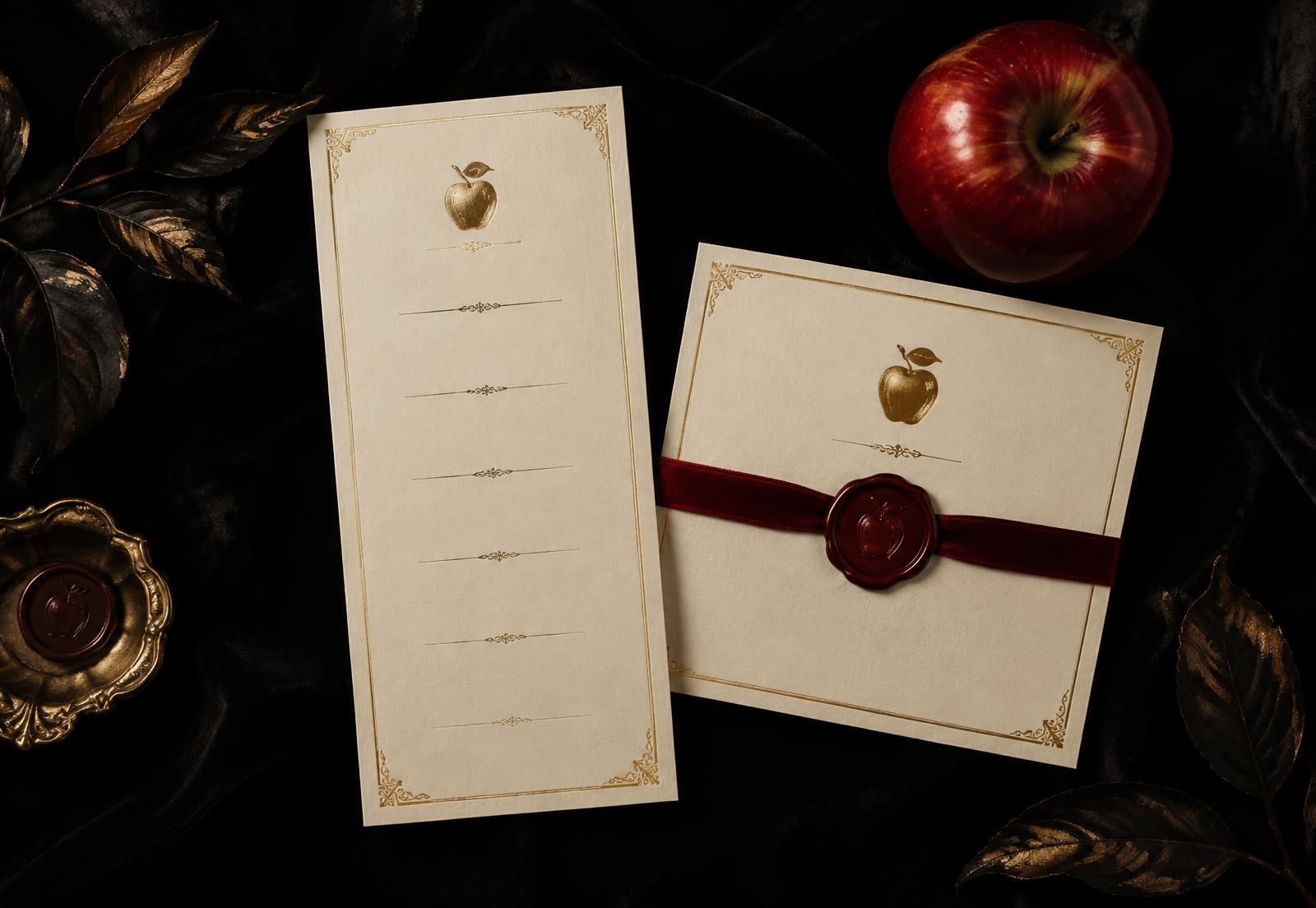
An engraved gold apple, framed like a keepsake.
Matte black stock with antique-gold foil and an ornate fine-line border. The apple is rendered as an engraving — the same fruit, seen through the lens of craft. Coloured glass carries the variant; the label never changes.
Conceptual mockups — not existing products
“The Bite” — a commercial concept.
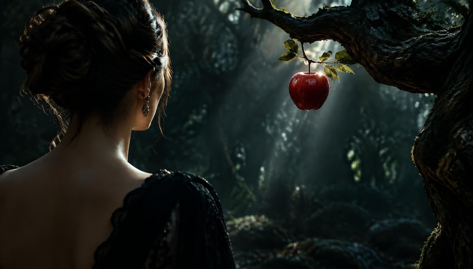
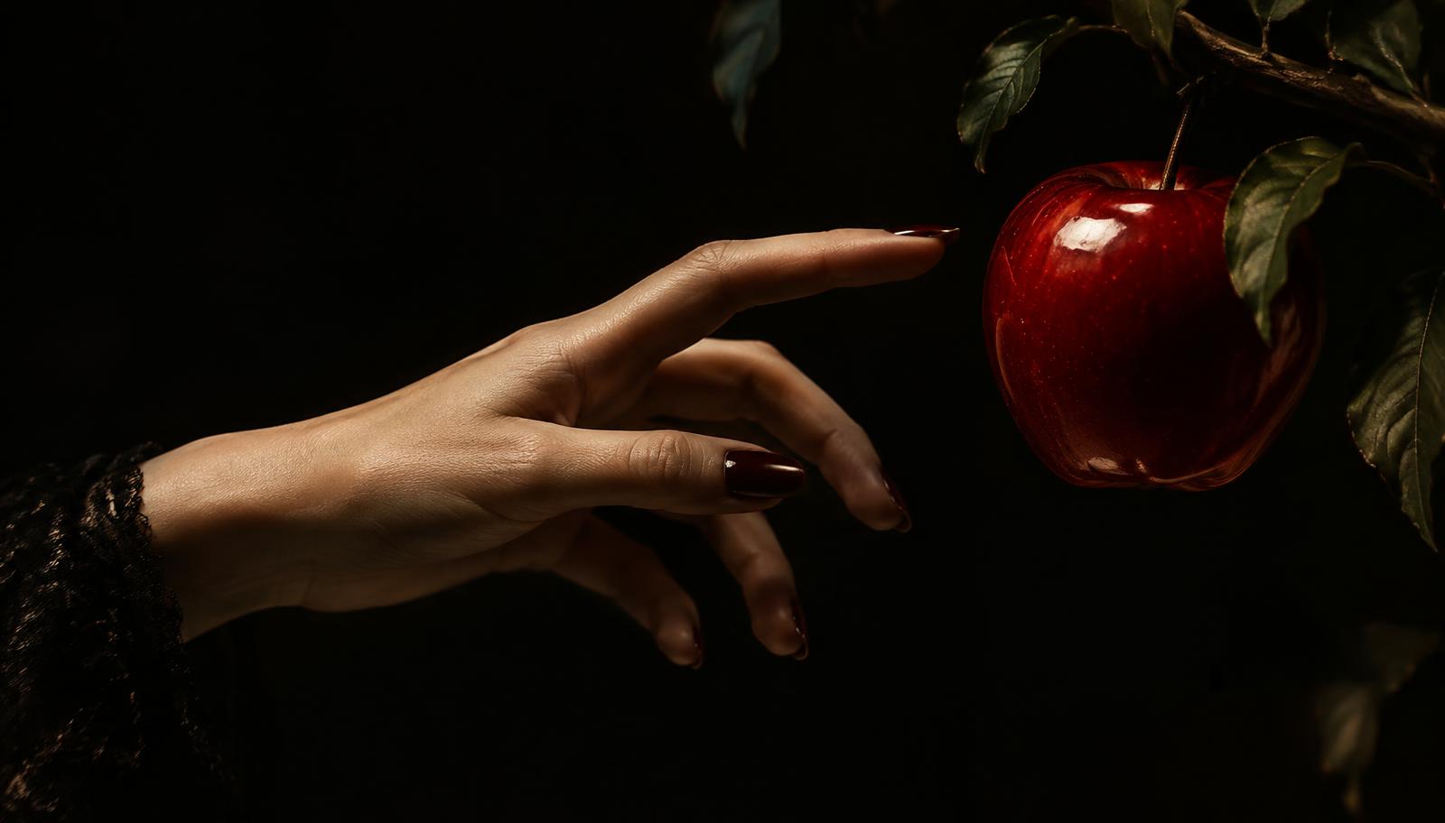
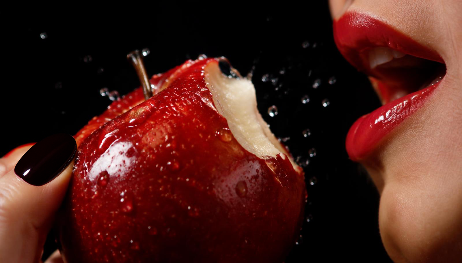
Imagined as a luxury fragrance film, reimagined for cider. Six frames move from temptation to surrender. Presented as a storyboard; no film has been produced.
01
The Entrance
02
The Discovery
03
The Fruit
04
The Reach
05
The Bite
06 — The Seal
CameraCut to black. Logo fades up, centred.
SoundThe crunch echoes once, then silence.
IntentA knowing smile, in type.
Go on.
Bad Apples
Just one bite.
Bad Apples
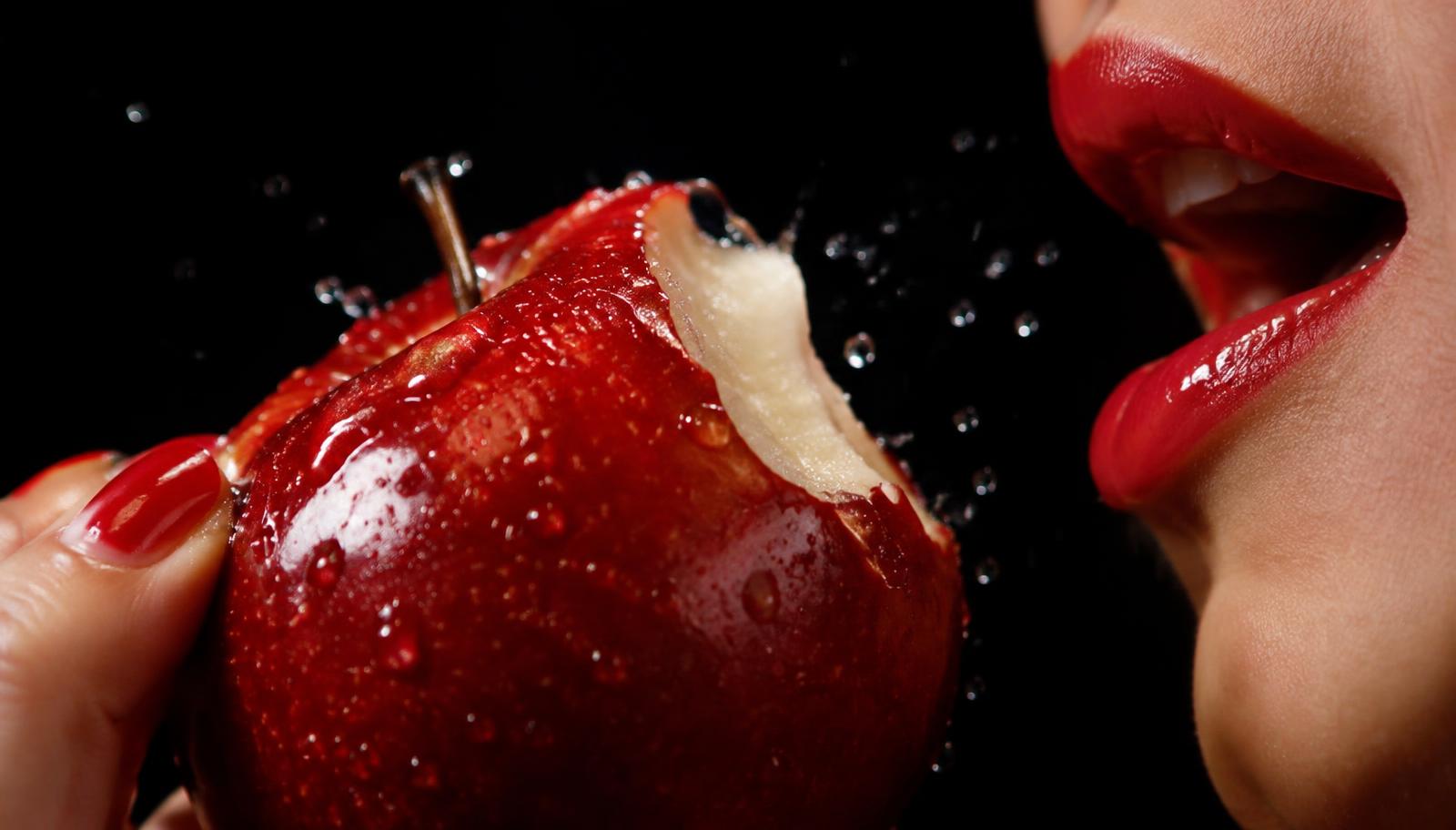
We won't tell.
Bad Apples
Social campaign concepts
One idea, held with discipline, becomes a whole universe.
Invert the name. Let “bad” do the provoking so the imagery can do the seducing. Curiosity is the hook; beauty is the payoff.
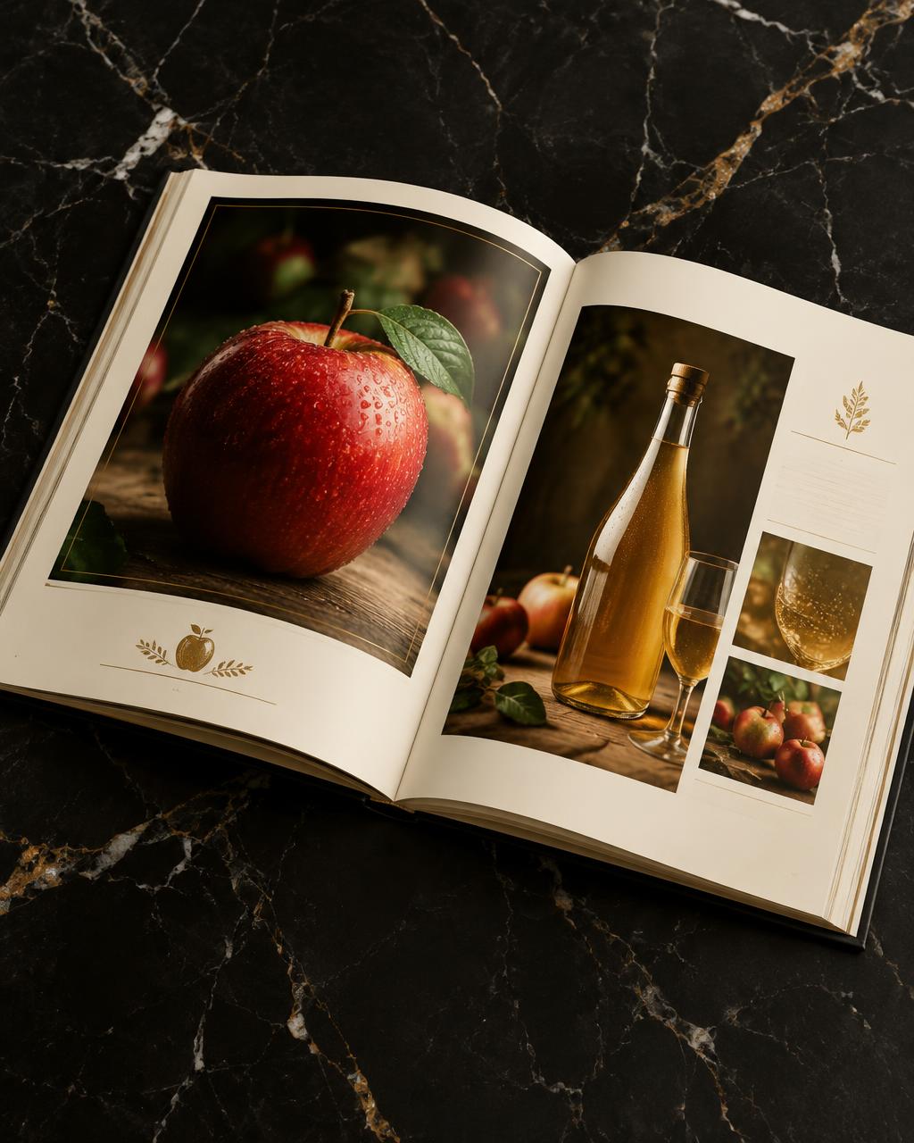
One hero object, always flawless. Black space removes context so the apple becomes iconic, not agricultural.
Serif for confidence, script for intimacy. Together they sound like an invitation from someone you shouldn't trust — and do.
Red is rationed. Gold is jewellery. Green keeps it honest. Black does the rest.
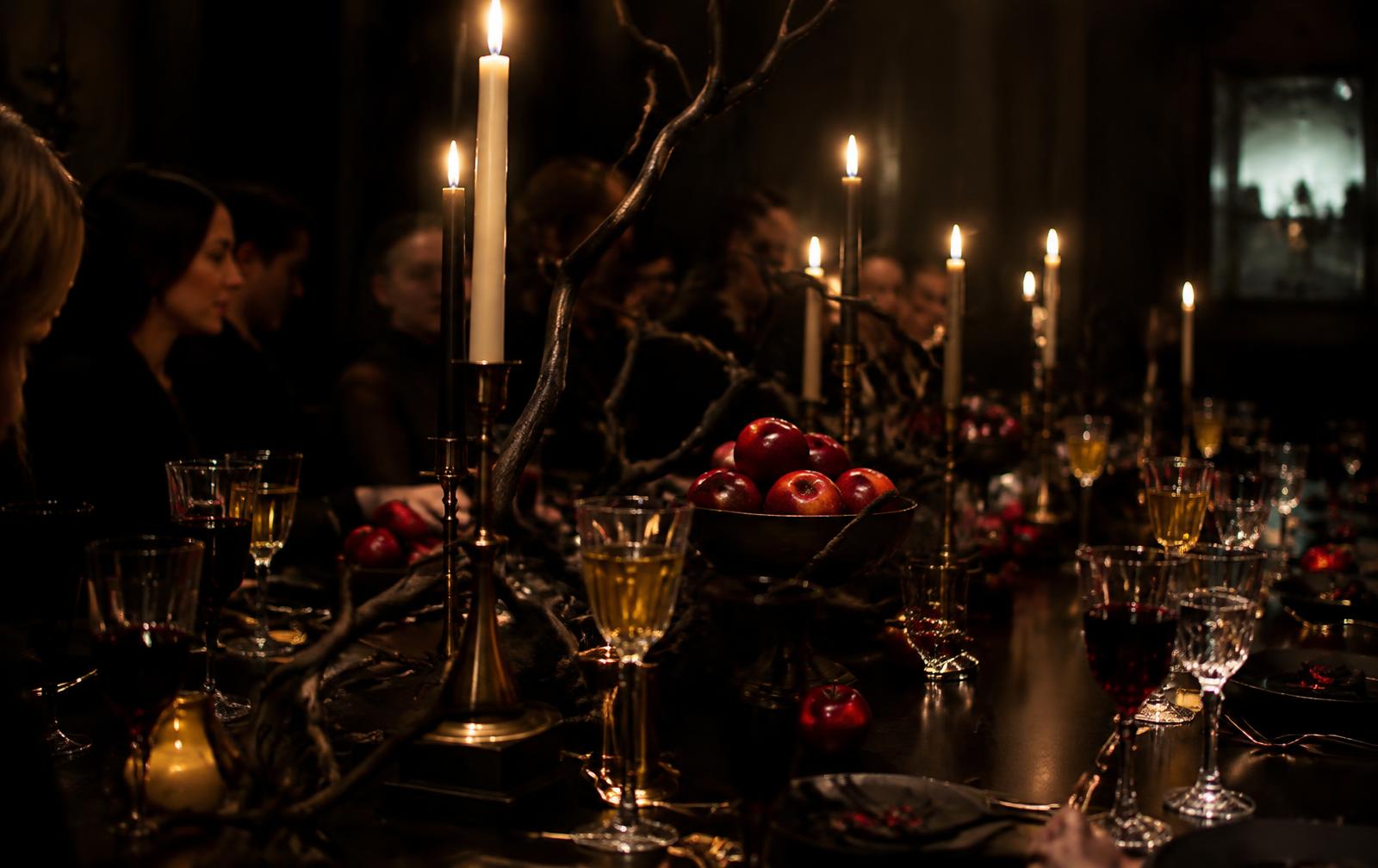
Romantic, never sweet. Mysterious, never frightening. Luxurious, never pretentious. For adults of every kind.